 [ Homepage ] [ Allwebco Design ] [ Allwebco Templates ] [ Allwebco Hosting ] 
[ Missing Page ] [ Thanks Page ] |
Template Style: HTML5 W/Mobile Overlay Public Domain Images: All Leonardo da Vinci (1452-1519) paintings used are in the public domain in the US and the source country. The US term being life of the author plus 80 years and Italy plus 70. Full & Mobile Setup - Getting Started Some files used on the main website will also be linked to from the mobile site inside the "mobile" folder. See notes *Full & Mobile below. To setup the matching mobile site see the help-mobi.html in the "mobile" folder. See also support details and support for the included Mobile Overlay. Step 1: CHOOSE HOMEPAGE: | More Details
Step 2: EDIT HEADER: | More Details Edit the "logo.jpg" in the picts folder with your logo image. The background HEX color can be edited in the "css" file in the colors folder. A "logo.PSD" file is located in the "extras" folder. The default font used is 36 points "CK Chemistry". If you want to change to another image type, edit the "header.js" in 1 place from .jpg to .png or .gif and place your logo image in the "picts" folder. OPTIONAL PLAIN TEXT HEADER: To use the text header option, edit the "var logotype" in the "header.js" from "graphic" to "text". Edit the "var logohtext" "Your Website Title" text in the "header.js" with your site name. Step 3: *Full & Mobile EDIT COPYRIGHT: | More Details Open the "footer-copyright.js" file in Notepad or any text editor, edit the "Yourcompany.com" text with your website or company name. This will update the footer info on all pages including the mobile website. Edit all ".js" files with a text editor. Step 4: *Full & Mobile EDIT CONTACT INFO: | More Details Open the "contact.js" file in Notepad or any text editor and change the company name, address, phone and fax number and email address (edit the email in 2 places). This will update contact info on the "contact" page (both full and mobile sites). Step 5: EDIT THE CONTACT AND QUOTES FORM: Click for current info on setting up the template forms. Click for info on adding more fields to the forms. Click for changing form sizes or colors. If you want to use only e-mail on the contact page you can remove the contact form from the "contact.htm" between the comment tags. Because of the complexity of setting up the quote form, there are notes in the "quotes.htm" to help you cut and paste to add new form fields. The form will work with most contact form scripts however you will need help files or a sample form from the script you intend to use. Most form elements work the same way from script to script, however the hidden values usually vary. You may want to consider editing the entire page in Notepad instead of a wysiwyg editor. Step 6: SETUP HOMEPAGE JQUERY SLIDESHOW: | More Details The "index.html" includes a slideshow application called the "jQuery Cycle Plugin". In the "JQuery" folder replace 5 images, "imageJQ-1.jpg" through "imageJQ-5.jpg". Make your images 983 x 450 pixels. This will update the homepage animation. Click the link above for details and options. Edit the "index.html" to add more images. Edit the ".JQ-size" class in the css files in the "colors" folder to change the image sizes. NOTE: Try to use a smaller byte sized image for the first image "imageJQ-1.jpg" for faster loading of the homepage. It is best to save these images at medium high quality. Step 7: *Full & Mobile SETTING UP THE LYTEBOX GALLERY: | More Details | Thumbnail Help This template is using Lytebox slideshows in all gallery pages. Click here for setup details. The best way to setup the pictures in the gallery is to replace the .jpg pictures in the "gallery" folder with your own by overwriting the files that are in there now and using the same generic names. This will setup both the full and mobile gallery images. Note: Set the color for the Lytebox popup in the "lytebox-JQ.css" inside the "JQuery-lytebox" folder. Replace the "Fgallery" pictures in the "gallery" folder with full size photos. Replace the "gallery" pictures with your thumbnails. The thumbnails are now 150 x 100 pixels, Fgallery images are 750 x 500 pixels, but you can make them any size that you prefer. It is best not to go wider than 150 for the thumbnails for mobile. See links above for more details. This will setup both the full and mobile gallery and all slideshow images (mobile and full site). Step 8: *Full & Mobile EDITING PAGE IMAGES: | More Details Each webpage includes a picture named according to the page it's on. You will find all pictures in the "picts" folder. Right click, or hover your mouse over any image for info on the image including sizes. Images for the "index.html" are called "home". Some images in the "picts" folder are used on both the full and mobile website. Images for the mobile site are located in the "picts-mobi" folder inside the "mobile" folder. Step 9: EDIT RIGHT SIDEBAR: | More Details Open the "sidebar-right.js" file in Notepad or any text editor, and edit the text and links with your own text. You will also find some options you can change at the top of this file like turning on and off paragraphs. Editing the "sidebar-right.js" will update all the pages at one time. Step 10: *Full & Mobile EDIT TWITTER FACEBOOK LINKEDIN LINKS: | Social Links | .js variable editing Open the "social-links.js" in a text editor and edit the 3 link variables with your link to Twitter Facebook and LinkedIn. The "social-links.js" includes "yes/no" variables to turn off any or all of the social links. Variable editing help. This will update both the full site and mobile footer social icons. Step 11: payments.htm PAYPAL PAYMENT PAGE: This template includes a Paypal payment page called "payments.htm". Edit the "paypal@your-web-domain.com" in this page with your Paypal e-mail and you can use this page to accept custom payments by sending clients a link to this page and having them fill in the amount on the payment page. Step 12: *Full & Mobile CHOOSE / CHANGE YOUR COLOR THEME: | More Details Edit the "colortheme.css" to change your template color theme (changes both full and mobile site). Click link above for more details or to custom edit your template colors. The header "view mobile" color can be edited in the "header.js" to black or white. Available icon colors are listed in these files. To have a different theme for the mobile site see the help-mobi.html. Step 13: EDIT PAGES: | Software choices | Notepad Editing Edit the text on all HTML pages with your information. You can use Dreamweaver, Exp Web, any wysiwyg HTML editor or a text editor like Notepad. Take care not to delete any of the HTML tags that surround the text. Step 14: EDIT TITLES, DESCRIPTIONS AND KEYWORDS: | More Details Open each of the HTML pages and change the titles (at the very top of the page) and also the description and the keywords to match your product or service. You can edit one page and copy and paste to the other pages. Be careful to only change what's inside the "" so you don't disturb the html code. Page titles are important so your site will get a good listing at Google, Yahoo! and other search engines. Step 15: *Mobile SETUP THE MOBILE WEBSITE: | More Details See the help-mobi.html located in the "mobile" folder. Step 16: *Mobile UPLOAD: | More Details Upload the pages on to your hosting company's server using ftp software or Windows Explorer or your control panel. Be sure to upload all template files and folders and all files inside the folders. You do not need to upload the "extras" folder. Options: EDITING THE FOOTER "footer.htm": | More Details You will edit the "footer.htm" like any other HTML page. Editing the "footer.htm" will update all the pages at one time. If you need more height in the footer you can edit the "footer-height" style class in the "FOOTER OPTIONS" section in the .css color file you are using in the "colors" folder. MOBILE OVERLAY: | More Details All of the full site main template pages include a mobile select overlay. You can see this select box if you make your web browser as narrow as 652 pixels. Files for the mobile select are in the "mobile-select" folder. Edit the "select-overlay.js" to change the overlay text. Edit the "select-overlay.css" to change font sizes and layout. Edit the css color theme files in the "colors" folder to edit the overlay colors. Turn off the select overlay in the "select-overlay.js" in the "mobile-select" folder. Click link above for details. REMOVING THE MOBILE SITE: To remove the mobile site. Turn off the overlay as outlined above, remove the link to the mobile site in the "site_map.htm" and "index.html" and turn off the mobile icon in the "header.js". SETTING UP THE SLIDESHOW PICTURES: | More Details The slideshow is currently setup to display all "Fgallery" pictures in the gallery folder. If you would like to add or remove pictures from the slideshow, open the slideshow.htm in Notepad and look for the "EDIT THIS AREA" note. Copy and paste to add new pictures to the list, or delete lines to remove pictures. You can also set the AutoPlay speed. Look for "var rotate_delay = 3000". See the help-mobi.html for mobile slideshow options. WATERMARK SETUP: | More Details You can configure the placement of the watermark over the image closeup views in the Lytebox gallery by editing the "lytebox-JQ-??.css" color files in the "JQuery-lytebox" folder. In the "JQuery-lytebox" folder are 2 .png images called "watermark-desktop.png" (300 x 40 pixels) and "watermark-mobile.png" (200 x 27 pixels). You can replace these images with your own semi transparent .png images. You can resize the watermark images. Be sure to test for mobile. Turn the watermark off at the bottom of the "lytebox-JQ.css" in the "JQuery-lytebox" folder. FONTS: *Full & Mobile | More Details You can change your font colors and sizes by editing the .css color theme file you are using in the "colors" folder with a text editor. You can find other font colors by clicking here. Edit the "body" code right after the "THE NEXT LINE CONTROLS THE DEFAULT FONT SIZE" note to change the copy on all pages. Change the "title" or "subtitle" px size to change all the title sizes. Changes in the color css files update both the full and mobile sites. MENU / CHANGING / ADDING BUTTONS: | More Details A total of 4 menus are included in this template:
You can add new pages by copying button code in the "menu.js" (or any menu file) and pasting it below itself. You may want to back up your files before you edit them. 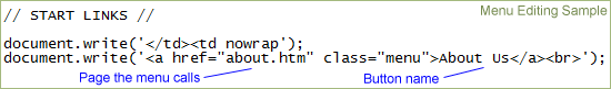 PICTURES: | More Details You can replace all template images with your own. Each webpage includes a picture named according to the page it's on. You will find all pictures in the "picts" folder. Right click, or hover your mouse over any image for info on the image including sizes. ADDING PAGES: | More Details You can add pages to your website by copying and pasting any one of the pages and renaming it to whatever you need. You can then add links from the other pages or even add the page to the menu by opening the menu.js and copying and pasting one of the buttons below another. There are notes in the "menu.js" to help you add a button. PAGE HEIGHTS: So all your pages will maintain a standard height a "pageheight" class with a "min-height" is included. Edit this height in the .css color theme file you are using in the "colors" folder. PAGE WIDTHS: So all your pages will maintain a standard width a "pagewrapper" class for the page outer width, and also a "contentwrapper" class is included. Edit these class widths in the .css color theme file you are using in the "colors" folder. SITE MAP PAGE: The "site_map.htm" is linked from the index.html. It is best not to remove this link so search engines can find your site map and properly list all your pages when users search at major search engines. |